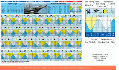
The most successful element of this professional tide calendar was the tide graph part of it. It was very detailed and used different colors to show different parts of the tide. They also included a blown up picture of one of the days so you can see where the best fishing times are, when not to go fishing and the rise and set of the sun and moon.
The message was just to show a tide calendar for fishing with helpful ideal fishing times, and good and bad days to go out. I know this is the message because they even have a little fish icon labeling when the fishing is good or bad.
I think fisherman were the intended users of this calendar because this tide calender has a lot to do with fishing and it also has that good or bad fishing day icon and the ideal times to go out and fish.
The small image in the calendar gives you the first hint that this calendar was meant for people on boats. As I have mentioned in the past two questions, the largest element that helps deliver the message for me is the little fish icon labeling which days are good and which days are bad. The shaded regions also look like they would be helpful to deliever the message of when to go fishing and when the sun is rising and setting.
The creator of this work used fish icons to have the reader get the information they need at a glance in a very easy to show way, and it is helpful if you dont know how to read all of the different shaded regions and graphs. I think this technique was used to be helpful and simplify the calendar.
I chose this work sample because I really started thinking about the tide part of our calendar on Friday. I think it is going to be very important that we do that part of the calendar right and in a timely fashion. It was helpful to look at an extremely detailed and professional example to give me an idea of what a full on tide calendar looks like.
No comments:
Post a Comment